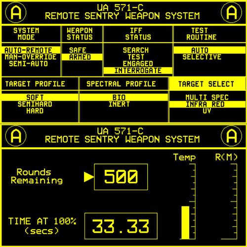
There’s a scene in the movie Aliens (1984) where the suspense was building up due to the impending fact that a large pack of extra-terrestrial man-slayers were coming to give the heroes a lot of violent hugs and brutal kisses.
So the Colonial Marines set up 2 sentry guns to shoot them all down from the safety of another room.
Funny how the user interface for the sentry gun adds to the build-up of suspense.

This is one good example of effective user interface design. Simple, understandable and obviously usable. No moving particles or random neon boxes popping around the screen. When you look at it, it seems though you could easily set up a sentry gun for yourself.
Just got reminded by a 40-year old movie to design effectively.