My wife quipped at me while looking at a wedding website I just built for our friends who are about to get married. When she told me “your”, she was mentioning developers and other websites and software in general.
Looking at the wedding website, I told her “I don’t know, but yes you’re right I’ll try to change this.”, and I began skimming through other design “trends” for inspiration.
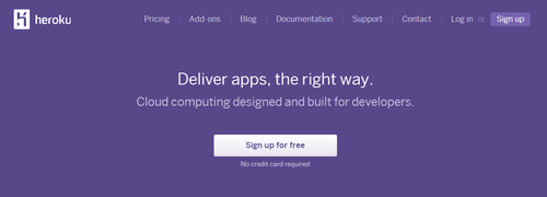
I remembered how famous stitches and ribbons were back in 2009, then came a large amount of skeumorphism. Right now everything is going minimal. Heroku recently changed their design, Github, Google and countless others.

The web was pretty “designless” late 1990’s, due to the fact that developing for the web had a high barrier to entry and that front-end technologies were not as mature as it is right now for people to implement what they had in their minds.
My wife told me that the new themes on tumblr are pretty, especially Optica, it’s the type of “cute” and “malinis” (Filipino word for clean) that she likes. It’s 2013 and “everything is going flat” as most would say, sometimes I do wonder why all websites tend to go the same direction each year.
Now, one thing I learned from my parents about the free market when I was in high school:
Wherever there’s money, everything else follows.
The free market is as is - it’s free. So to anyone who can afford to pay for what they want (ability to create demand), the amount of supply for that someone increases. That’s why tons of people pay developers 80-120K USD a year to put little boxes in web browsers while charity workers in third world countries get paid significantly lesser.
This very same brutal rule applies to web design.
Design changes in the previous years and decades aren’t dictated by on what’s “cool" or how “hip" websites look. It may look like it, but that’s a shallow way of looking at trends. There’s something deeper beyond trends in web design: metrics do not lie. The high importance of quality and clear content nowadays is a fruit of the noise in the world.
For the world of design this means there’s high value in simple typefaces, and noise-less, minimalistic design that’s easy to load and create for any device. If this type of design converts well, can be easily produced and increases the value you wish to attain for your organization, may it be revenue or just plain spreading your wedding details around, everything else in how the market works will trend in that direction.
Sameness is a market effect, not a technological one.
Although, someone commented in HN that the easier way was just to look at her and say “Twitter Bootstrap :) ”