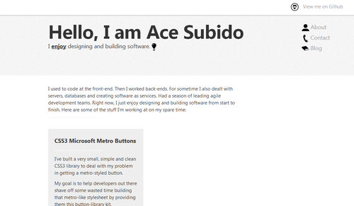
Tonight, I’ve decided to spend a chunk of time redesigning my blog from 9pm to 10pm:
(blog: before)

(blog: after)

and my github page
(github page: before)

(github page: after)

I figured I’d remove most of the components in the blog that doesn’t help me reach my goal: making it more readable. So I gathered up some inspiration from minimallyminimal.com, medium and svbtle.com. Now I feel much better writing freely in this clean, clutter-free and readable space.
Minimalist design
For the past few months I took it upon me to get a handle on minimalist design principles on real-world applications. Since then I’ve been reading up on typography, the golden ratio, CSS grid systems, color schemes, and HTML/CSS3/JS diving (hello codepen.io, dribbble and patterntap) just to get a feel.
I figured that learning about minimalist and modern design principles could lead me as a developer to make the things I build look mildly appealing to the eyes while the project is still in it’s infancy.
Learning about minimalist design allowed me to focus more on developing and shaping my product rather than over-thinking how my buttons would look like and why my extremely contrasting colors burns my clients eyes every time they glance at the project while it’s being developed. Having a presentable, organized, simple, uncluttered and appealing design foundation during the development process helps a lot. It simplifies and streamlines the design and functional decisions as the day to roll-out and finalize the product draws near.
Concluding the night
Took out most functions and left it with something easy on the eyes. Thanks to my fiance for accompanying me all night via skype :)

And that’s her cute impression of the “Overly Attached Girlfriend” meme :)
After she saw this redesign. She absolutely adored how simple it looked. Now I’m working on turning the design on her tumblr to look like this one :)